

How Carrier Coverage Maps Are Built
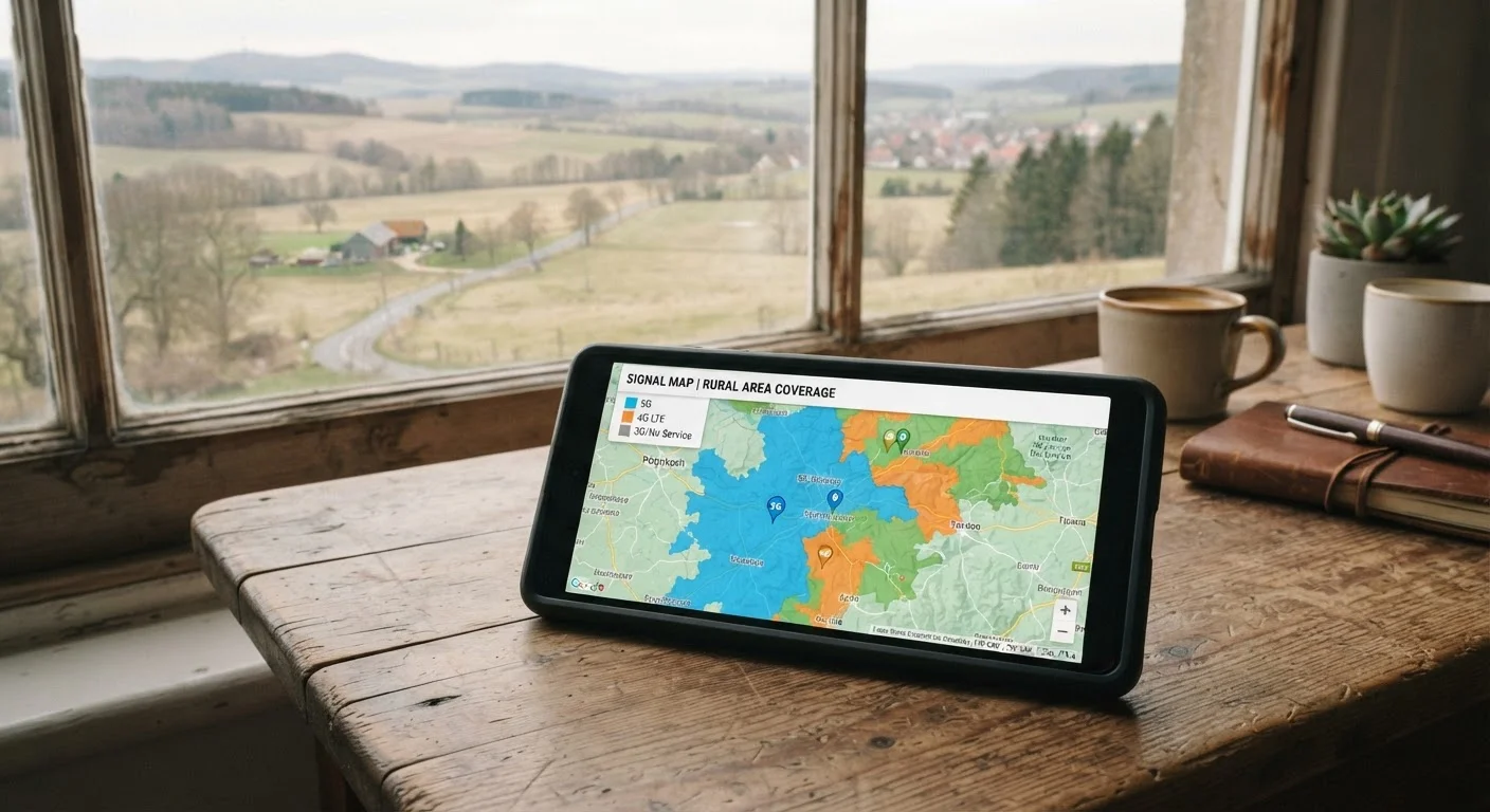
When you visit a carrier's website and check whether their network reaches your neighborhood, you're looking at a map built from signal propagation models - not from live readings of actual signal strength. Carriers use the known locations of their cell towers, radio frequency engineering data, and terrain analysis to predict where a signal should theoretically reach.
Those predictions are then translated into color zones: typically solid colors for strong coverage, lighter shades for roaming or extended areas, and white space for no coverage. What they can't easily model - and almost never show - is the practical reality of how signals behave once they encounter the real world.
To understand the terminology carriers use on and around these maps, see our plain-language guide to wireless carrier jargon for definitions of terms like band, spectrum, and deprioritization.
Maps Reflect Network Infrastructure, Not Guarantees
The FCC requires carriers to submit coverage data for public mapping purposes, but this data is self-reported and uses the same modeling approach carriers apply to their own consumer maps. Independent validation of coverage claims remains limited, and regulatory map standards have evolved over time as accuracy concerns have been raised.
What the Map Colors Leave Out
Coverage maps are optimistic by design. They typically assume an outdoor user with a clear line of sight to a tower. Several real-world factors routinely undercut that picture:
- Building materials: Concrete, metal framing, and low-emissivity window glass all attenuate radio signals. A zone marked as covered may have little to no usable signal once you're inside a modern office building or apartment.
- Terrain: Hills, ridgelines, and dense vegetation can block signals even when a tower is technically nearby. Valleys in particular create dead zones that propagation models often miss.
- Network congestion: Coverage and capacity are different things. A tower may reach your location but be serving so many devices simultaneously that data speeds become unusably slow - especially during peak hours or at crowded events.
- Device capability: Not every phone supports every frequency band a carrier uses. A coverage zone built on a specific band may be invisible to an older or budget device that doesn't support it.
Up to 30 dB
Signal loss caused by building materials indoors
Radio frequency engineering research indicates modern building materials such as low-emissivity glass and reinforced concrete can attenuate cellular signals by up to 30 decibels - enough to drop a strong outdoor signal to near-zero indoors.
3 types
Distinct 5G spectrum bands often shown as one zone
Low-band, mid-band, and high-band (millimeter wave) 5G each offer different speed and range characteristics, yet many carrier maps shade them all as a single undifferentiated '5G coverage' zone.
These gaps aren't unique to coverage maps. Similar limitations apply whenever a standardized document tries to summarize something complex - much like how a home inspection report gives a useful snapshot but can't capture every future problem.
The 5G Labeling Problem
5G coverage zones on carrier maps deserve special scrutiny. 5G is not a single technology - it encompasses low-band, mid-band, and high-band (millimeter wave) spectrum, each with dramatically different speed and range characteristics. Low-band 5G travels far but may deliver speeds only modestly faster than good 4G LTE. High-band 5G is very fast but has limited range and struggles to penetrate walls.
Many carrier maps shade a broad area as "5G" without distinguishing which type of 5G is actually available there. A consumer standing in what appears to be solid 5G territory may be receiving low-band 5G that tops out at modest speeds - a far cry from the marketing imagery of near-instant downloads.
For more on how plan language is used to set expectations, see our guide to reading a wireless plan's fine print.
MVNOs: Same Map, Different Experience
Mobile virtual network operators - commonly called MVNOs - lease capacity from major carriers and resell it under their own brand. Because they use the same physical towers, their coverage maps often look nearly identical to the host carrier's map.
The key difference is data priority. During congested periods, MVNOs are typically assigned lower priority than the host carrier's own customers. That means in a fully covered area, an MVNO customer may experience noticeably slower speeds than someone on the primary network - even though both are technically on the same tower.
Our article on how MVNOs work explains this capacity-leasing model and what it means for day-to-day performance.
Test Before You Transfer Your Number
Porting your existing number to a new carrier locks you in before you've had a chance to evaluate real performance. Where possible, test with a temporary number or secondary SIM first, then port once you're confident the coverage works where you need it most.
How to Actually Test Coverage Before You Commit
The most reliable way to evaluate a carrier's real-world performance is to test it yourself in the places you use your phone most: your home, your workplace, your commute route. Several practical approaches can help:
- Trial periods: Many carriers offer a limited trial window or money-back period. Use it actively - not just in one spot, but everywhere you typically rely on your phone.
- Temporary SIM cards: Some carriers offer short-term prepaid options that let you test the network without a long-term commitment.
- Community feedback: Apps and forums where users report real-world signal quality can surface patterns that maps never capture, particularly for rural routes or specific building types.
- Ask locally: Neighbors, coworkers, or family members already on a given carrier can offer the most grounded account of what service actually looks like in a shared location.
Coverage maps are a starting point - a useful filter for eliminating carriers with no presence in your region. But they should never be the final word. Pair them with direct testing and, where relevant, check whether plan features you're paying for actually work as described. Our piece on plan features that rarely deliver in practice can help you sort marketing claims from genuine value.
Frequently Asked Questions
They are approximations, not guarantees. Maps use signal propagation models based on tower locations and terrain data, which means real-world performance - especially indoors or in hilly areas - often falls short of what the map suggests.
Coverage maps don't account for obstacles like concrete buildings, dense foliage, or valleys that block radio signals. Indoor signal loss alone can reduce usable coverage significantly, even in areas marked as well-covered.
MVNOs use the same physical towers as the major carrier whose network they lease. However, they are often assigned lower data priority, meaning speeds can drop more sharply during congested periods even in covered areas.
Look for carriers that offer trial periods or money-back guarantees. You can also ask friends or neighbors with that carrier about their experience in the specific locations you frequent most.
5G coverage zones can include multiple technology types - including slower low-band 5G - that may not deliver the fast speeds consumers expect. The map may not distinguish between these, so speeds can vary widely within a shaded 5G area.
Yes. Even in zones marked with strong coverage, heavy simultaneous usage from many devices on the same tower can reduce speeds significantly. This effect is more pronounced during commute hours, events, or in densely populated areas.
The content on this site is provided for informational purposes only and should not be considered a substitute for professional advice. While we strive to provide accurate and up-to-date information, we make no guarantees regarding its completeness or accuracy. Always consult a qualified professional for advice specific to your circumstances before making any decisions.